
Visual storytelling: photography and Video tipsfFor high‑end E‑Commerce
There's a distinct difference between showing a product and making it unforgettable. In high-end e-commerce, your images and videos don’t just display-they seduce, inform, and build desire. Every frame must carry intention, from the precision of lighting to the rhythm of motion, because perceived value is shaped long before purchase. You’re not just selling an object. You’re selling an aspiration, captured in pixels.
Key Takeaways:
- A high-end product image does more than display an item-it constructs a mood, often using shallow depth of field to isolate the subject and draw attention to fine craftsmanship, such as the stitching on a luxury handbag or the texture of hand-polished wood.
- Consistent lighting setups across a product line create visual cohesion, allowing customers to compare items without distraction, as seen in the catalog of a premium watch brand where every timepiece reflects light at the same angle.
- Short-form video loops under 15 seconds, when autoplayed silently on product pages, can increase conversion by demonstrating function-like the smooth opening of a magnetic clasp or the drape of a fabric-without requiring user interaction.
- Shooting from multiple angles, including macro close-ups and lifestyle contexts, supports both aesthetic appeal and practical decision-making, giving shoppers a tactile sense of scale and material even without physical access.
- Investing in a dedicated color-grading workflow ensures that what appears on screen matches the true hue and finish of the product, preventing costly returns due to color misrepresentation, especially critical for textiles and painted surfaces.
The philosophy of the lens
Capturing the Soul of the Object
Photography in high-end e-commerce transcends mere documentation. You reveal the essence of a product by isolating its defining gesture-a hand brushing over hand-stitched leather, light catching the curve of a ceramic glaze. The moment feels intentional, not staged. Emotion emerges not from context but from attention, as if the viewer has leaned in to examine something rare. A limited-edition watch isn’t sold by its specs alone but by the quiet precision of its second hand sweeping across a sunburst dial.
The allure of minimalist Composition
Empty space is not wasted space. You use negative space to direct focus, allowing a single object to dominate without distraction. A white backdrop doesn’t erase context-it clarifies intent. Minimalism removes noise, not meaning, so the viewer sees only what matters: the grain of a leather strap, the symmetry of a pendant’s cut. A mid-sized SaaS firm selling luxury skincare applies this by framing each bottle against soft gradients, letting droplets on glass suggest freshness without clutter.
Designers at heritage fashion houses often shoot accessories with no human presence, relying on composition to imply use. The angle of a bag’s handle suggests the fall over a shoulder. Shadows define volume where props might over-explain. This restraint builds desire through suggestion, not saturation, training the eye to appreciate detail others overlook.
Lighting as the ultimate artifice
Mastering the golden hour in the studio
Replicating golden hour indoors requires precise control of color temperature and diffusion. You can simulate that warm, low-angle glow with tungsten-balanced lights softened through scrims or silk panels. Position the source just outside the frame to mimic the sun’s natural trajectory, casting a gentle gradient across the product. The subtle warmth enhances material richness, especially in textiles or wood finishes, making the object feel lived-in and desirable.
Shadows and the depth of desire
Shadows are not absences but active elements that define form and evoke intrigue. When you shape darkness deliberately, you guide the eye toward contours, textures, and negative space that suggest exclusivity. A sharply defined shadow along a watch face or handbag seam can imply precision craftsmanship. Controlled shadowing transforms flat surfaces into sculptural statements, inviting closer inspection.
Consider how luxury watch brands often photograph timepieces at oblique angles with a single light source, allowing the case’s bevels to cut through darkness. That contrast isn’t accidental-it’s engineered to mirror the tension between visibility and mystery that defines high-end appeal. The right shadow can imply rarity by making the product feel partially revealed, as though it exists just beyond full comprehension.
The narrative of motion
Cinematic flow in product videography
Smooth transitions between shots guide the viewer’s eye without distraction, creating a sense of continuity that feels intentional and refined. A luxury watch, for instance, might move from a close-up of its ticking mechanism to a slow pan across its polished band, all within a single unbroken take. Any abrupt cut or shaky movement breaks the illusion of exclusivity, undermining the product’s perceived value. Precision in motion mirrors precision in craftsmanship.
The rhythms of luxury sequences
Tempo defines how a high-end product is emotionally received, with slower pacing often signaling sophistication and attention to detail. A handbag unfolds in real time, each compartment revealed at a deliberate pace, allowing the viewer to absorb textures and stitching. Rushing this sequence sacrifices the sensory engagement that luxury buyers expect. Silence, too, can be part of the rhythm-pausing on a single detail speaks louder than constant motion.
Consider how a Parisian atelier films its seasonal collection: minimal music, no voiceover, just the soft sound of fabric brushing against stone. The camera lingers on a single glove being placed on a mannequin, the light catching its seam. This restraint isn’t omission-it’s curation. Luxury storytelling favors absence over excess, letting the product’s presence dominate through timing and silence.
Technical precision and elegance
High resolution as a moral imperative
Presenting a product in less than optimal resolution borders on misrepresentation. Every thread, finish, and contour must be visible to honor the craftsmanship behind luxury goods. You risk eroding trust when pixelation obscures authenticity. A discerning buyer expects to zoom into a hand-stitched seam or the grain of exotic leather without degradation. For a limited-edition timepiece, even the faintest reflection in a sapphire crystal should remain sharp at 200% magnification.
Color theory and the palette of wealth
Colors silently communicate value, status, and emotion. Deep charcoals, warm ivories, and muted metallics signal exclusivity more effectively than bright primaries. You align with luxury conventions when your palette mirrors the restraint seen in haute couture boutiques or private galleries. A mid-sized SaaS firm selling premium design tools shifted from cobalt blue to a soft taupe interface, reporting increased perceived sophistication among enterprise clients.
Neutral dominance doesn’t imply dullness. Subtle tonal layering-like pairing oyster linen with brushed nickel-creates depth without clamor. You guide attention through contrast in luminance, not hue. Consider how a champagne highlight on a black leather handbag draws the eye to its hardware, making the clasp feel like jewelry. This precision in tonal hierarchy reinforces desirability.
The digital gallery experience
Seamless integration of media
Your product presentation gains authority when photography and video coexist without friction. A luxury watch brand, for instance, embeds slow-motion clips of the crown being turned directly within its image carousel, activating engagement without redirecting the user. This method keeps attention anchored, reducing bounce rates while deepening interaction. Each media type supports the other, not competes.
Immersive textures and sensory details
High-resolution macro shots reveal the weave of Italian leather or the grain of hand-polished wood, triggering subconscious tactile responses. A single frame of light catching the edge of a brushed metal surface can convey durability and refinement more effectively than paragraphs of copy. These details simulate physical inspection, bridging the sensory gap of online shopping.
Zoom functionality should expose micro-textures, such as the stitching density on a limited-edition handbag or the patina of aged brass. When executed precisely, these visuals replace the need for in-store handling, allowing customers to assess authenticity and craftsmanship with confidence. A mid-sized SaaS firm selling artisan furniture reported higher conversion after introducing 12-megapixel close-ups with 360-degree spin.
Post-production alchemy
Retouching without deception
Subtle adjustments preserve authenticity while enhancing clarity. You remove dust spots, correct minor blemishes, and balance skin tones, but never alter bone structure or fabric texture. Distorting reality risks customer trust and increases return rates, as seen when a luxury handbag brand faced backlash for smoothing leather grain beyond recognition. Your edits should reflect what the customer will receive, not an unattainable ideal.
The final polish of perfection
Color grading unifies your visual narrative across devices and platforms. You apply consistent white balance, contrast, and saturation to ensure a silk dress appears the same in thumbnail and full view. Even a slight hue shift can misrepresent a $2,000 gown, leading to disputes and damaged reputation. Precision here maintains brand integrity at every touchpoint.
Attention extends to output settings: you export at exact dimensions required by the platform, preserving sharpness without bloating load times. A mid-sized SaaS firm reduced bounce rates by optimizing file size alongside visual fidelity, proving technical and aesthetic choices are inseparable in high-end commerce.
Final words
Every image you publish becomes a silent ambassador for your brand, shaping perception with a single glance. High-end e-commerce thrives on precision, where a sharply rendered fabric texture or the subtle reflection in a polished surface conveys quality more convincingly than any description. You control the viewer’s eye through deliberate composition, controlled lighting, and authentic moments captured in motion. A luxury watch filmed in slow motion as light glides across its face doesn’t just display a product-it sells an experience.
Consistency in visual language builds recognition and trust over time. Treat each photograph and video as part of a larger narrative, where color grading, framing, and pacing align across platforms. A mid-sized SaaS firm selling premium design tools increased engagement by aligning all product visuals with a minimalist aesthetic, proving that coherence amplifies impact. Your visuals are not supplements to your offering-they are the first and most lasting impression.
FAQ
Q: How does high-end e-commerce photography differ from standard product photography?
A: High-end e-commerce photography emphasizes narrative, texture, and emotional resonance, moving beyond basic documentation. A luxury watch isn't just shown on a white background; it’s captured mid-motion on a wrist at golden hour, with reflections in a polished surface suggesting exclusivity. The focus shifts from mere visibility to desirability, using composition and context to imply lifestyle and status. Standard product shots prioritize clarity and consistency, while premium visuals aim to evoke aspiration through deliberate staging and cinematic techniques.
Q: What role does video play in conveying premium product value?
A: Video introduces time and motion, allowing a handbag’s leather grain to be revealed through a slow pan, or a fragrance bottle’s cap to unscrew with a deliberate, satisfying click. A high-end skincare brand might use macro footage to show a serum absorbing into skin over 10 seconds, reinforcing efficacy through visual proof. These micro-moments build trust and sensory engagement that static images alone cannot achieve. The pacing, sound design, and transitions are calibrated to reflect the brand’s sophistication, not just demonstrate function.
Q: Which camera settings are most effective for capturing fine product details?
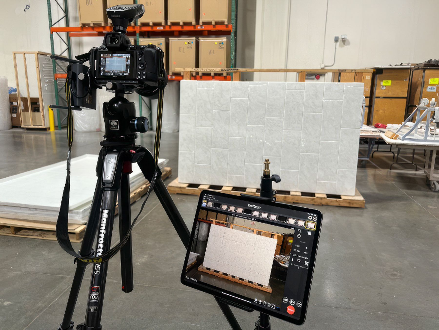
A: A narrow aperture, such as f/11 or f/16, ensures deep focus across intricate surfaces like embroidered fabric or engraved metal. Using a tripod and manual focus allows precise control, especially when shooting macro. A mid-sized SaaS firm selling premium camera equipment uses focus stacking in post to combine 15 frames, each focused on a different part of a lens barrel, resulting in a single image where every serial number and groove is sharp. ISO should remain low to avoid noise, and natural light or diffused strobes prevent harsh highlights on reflective materials.
Q: How can lighting shape the perception of luxury in product visuals?
A: Soft, directional light from a large source-like a north-facing window or a scrimmed studio light-creates gentle gradients that enhance volume and texture. A jewelry brand might use a single light source at a 45-degree angle to make a diamond’s facets sparkle selectively, avoiding the flat, even illumination typical of catalog photography. Shadows are treated as design elements, not flaws; a leather jacket photographed under low-angle light casts a long shadow that adds drama and depth. The goal is to mimic how light behaves in real-world environments where luxury items are experienced.
Q: What post-production practices maintain authenticity while enhancing premium appeal?
A: Skilled color grading ensures tones remain true to the physical product, avoiding oversaturation that could mislead buyers. A furniture retailer adjusts white balance to reflect how walnut wood appears under warm indoor lighting, not under clinical studio conditions. Retouching removes dust or sensor spots but preserves natural grain and weave. One European eyewear brand uses subtle vignetting to draw attention to the frame’s hinge mechanism, a signature design element. The edits support the story, not replace it, ensuring the final image feels both refined and real.