
Why user experience matters :the link between website design and consumer behavior
Many websites fail to connect with you because design and usability shape your perceptions and behavior. When navigation is confusing or load times are slow, you leave and revenue drops. Clear hierarchy, accessible content, and fast performance keep you engaged; good UX boosts conversions and trust. By measuring behavior and iterating design, you control engagement and influence buying decisions.
Key Takeaways:
- First impressions shape behavior: visual design and layout determine trust and whether users stay or leave within seconds.
- Usability drives conversions: intuitive navigation, clear CTAs, and minimal friction increase task completion and sales.
- Emotional design influences decisions: aesthetics, tone, and microinteractions create responses that affect brand preference and purchase intent.
- Performance and responsiveness impact retention: fast load times and mobile-optimized layouts reduce abandonment and boost SEO and conversions.
- Accessibility and consistency foster loyalty: inclusive design and predictable interactions increase satisfaction, repeat visits, and lifetime value.
Understanding User Experience
Definition of User Experience
You should think of user experience as the combined outcome of every interaction someone has with your product, where usability, accessibility, information architecture, visual design, content, and performance all intersect. In practical terms that means factors like how quickly a page loads, how clearly your checkout labels convey intent, and whether assistive technologies can navigate your forms determine whether a user completes a task or abandons it; task efficiency and perceived trust are core drivers of positive UX.
Concrete examples help: a three-field signup that validates input inline reduces friction compared with a multi-step form that fails only at submit, and a visible progress indicator on a checkout flow can lift completion rates. Research-backed benchmarks matter too - for instance, Google found that 53% of mobile visitors leave a site that takes longer than three seconds to load, so performance is as much UX as aesthetics.
Importance of User Experience in Design
When you optimize UX you directly influence business metrics: conversion, retention, average order value, and customer lifetime value. Studies commonly cited in the industry show that improving UX can increase conversions substantially - Forrester and other reports indicate conversion uplifts ranging from 200% to 400% for well-executed redesigns - and companies like Amazon have quantified the cost of latency, noting that every 100ms of delay can impact sales by around 1%.
Beyond single metrics, UX shapes brand perception and reduces support costs: simpler flows mean fewer help tickets and higher NPS. You should also account for regulatory and inclusivity factors; accessible designs not only expand your addressable market but also lower legal risk, so accessibility work is both ethical and practical.
To act on this, measure UX with both qualitative and quantitative signals: use task success rate, time-on-task, System Usability Scale (SUS), Net Promoter Score (NPS), and funnel drop-off analyses to prioritize fixes. Combining user testing, analytics, and A/B experiments gives you a defensible roadmap for improvements.
Historical Context of User Experience Development
UX evolved from mid-20th-century human factors and ergonomics-think WWII cockpit design-into a discipline that blends cognitive psychology, industrial design, and interaction design. Donald Norman popularized the term "user experience" in the early 1990s while at Apple, and throughout the 1990s the rise of the web forced designers to tackle new problems of information architecture and discoverability.
The past two decades accelerated that shift: Jakob Nielsen and Don Norman founded the Nielsen Norman Group in 1998 to formalize research and best practices, and the launch of the iPhone in 2007 pivoted the industry toward mobile-first thinking and gesture-based interactions. As a result, organizations moved from ad-hoc visual tweaks to disciplined, research-driven processes for product design.
Methodologies and tooling followed: wireframing and prototyping matured, A/B testing became mainstream for iterative optimization, and collaborative tools like Figma and analytics platforms such as Google Analytics and Hotjar enabled continuous feedback loops. These changes mean you can now validate design decisions with data and scale consistent experiences across products via design systems.
The Psychology of Consumer Behavior
Factors Influencing Consumer Behavior
Cognitive shortcuts and perceptual limits shape how you move through a site: Hick's Law shows that decision time increases roughly with the logarithm of available choices, and Miller’s 7±2 suggests working memory handles only about 5-9 items at once, so you should limit simultaneous options. Page performance also dictates behavior-Google reports that about 53% of mobile users abandon a site that takes longer than 3 seconds to load, and Amazon famously estimated that every 100 ms of latency cost roughly 1% in sales, so page speed directly ties to conversions.
- Perceived value - pricing, benefits, and framing affect willingness to buy.
- Social proof - reviews, ratings, and testimonials speed decisions.
- Visual hierarchy - layout and contrast guide attention and reduce friction.
- Scarcity and urgency - limited-time cues increase conversion velocity but can backfire if overused.
- Navigation simplicity - fewer, clearer choices shorten decision time and lower drop-off.
Recognizing how these factors interact helps you prioritize which UX fixes will yield the biggest lift in engagement and sales.
Emotional Connections and Brand Loyalty
Emotions steer long-term behavior more than rational arguments: studies show that up to 86% of buyers are willing to pay more for a superior experience, so design choices that spark positive feelings translate into higher lifetime value. You build those feelings through consistent visual language, tone of voice in microcopy, and interpersonal cues-personalized greetings, tailored recommendations, and humanized support foster an emotional connection that turns first-time visitors into repeat customers.
Brands that tap into identity and storytelling see measurable benefits: Apple’s product pages and unboxing rituals strengthen a sense of belonging, and subscription services that emphasize community and shared values report higher retention rates. Use emotion-driven elements (hero imagery, user stories, on-brand microinteractions) to create brand loyalty while A/B testing to ensure those elements improve metrics like repeat purchase rate and customer lifetime value.
More info: measure emotional impact with qualitative and quantitative tools-Net Promoter Score, sentiment analysis of reviews, heatmaps, and session recordings-so you can tie emotional design changes to concrete KPIs and iterate based on how users actually feel and act.
The Role of Trust and Credibility
Trust is the currency of online commerce: clear contact details, transparent pricing, and visible security indicators lower perceived risk and raise conversion. Research from BrightLocal shows a high reliance on peer feedback-many consumers read reviews before buying-so prominently displaying reviews, verified badges, and third-party endorsements strengthens credibility. You should also minimize surprises during checkout; unexpected fees are a leading cause of cart abandonment.
Technical signals matter as well-SSL/HTTPS, fast load times, and consistent branding reduce friction and signal professionalism. Case studies show that sites which consolidate trust signals (secure checkout badges, money-back guarantees, and easy returns) often improve conversion rates significantly compared with sites that hide policies or use inconsistent design language.
More info: practical steps you can take include adding a visible phone number, a searchable FAQ, explicit return and shipping policies, social proof near CTAs, and periodic audits of security and accessibility to maintain ongoing trust with your audience.
The Elements of Effective Website Design
Visual Design and Aesthetics
Good visual hierarchy directs your eye to what matters first: a bold headline, a supporting subhead, then a clear call to action. Strong use of whitespace, consistent typography, and high-quality imagery-think Apple’s product pages or Airbnb’s lifestyle photography-can lift perceived value and, in A/B tests, often produce double-digit conversion increases when combined with clearer CTAs. Prioritize contrast and legibility so your message is understood in a glance.
Consistency across layouts and components builds trust and speeds user decisions; design systems like Google’s Material or IBM’s Carbon show how reusable patterns reduce design friction. Follow accessibility guidelines-aim for a contrast ratio of at least 4.5:1 for body text-so your visuals work for more people and reduce legal and UX risk.
Usability and Navigation
Clear information architecture helps you find what you need without thinking: logical menu labels, breadcrumb trails, and an effective on-site search cut task time drastically. Performance matters: Google’s research shows that more than half of mobile visitors abandon pages that take longer than 3 seconds to load, so optimize images, leverage caching, and prioritize critical rendering paths to keep users engaged.
Interaction design should follow human factors-make touch targets large enough, minimize required steps, and surface progressive disclosure for complex flows. Small delays add up: Amazon found that even 100ms of latency can impact revenue, so minute performance gains directly affect your bottom line and user satisfaction.
Measure and refine navigation with task completion rates, session recordings, and funnel analysis: put the primary CTA above the fold on key pages, use 40-48px minimum touch targets for mobile, and prefer paginated product lists over endless scroll when users need to compare items. These concrete changes help you iterate toward flows that reduce friction and increase conversions-track task success and iterate rather than guessing.
Content Strategy and Relevance
Content should answer your users’ top questions within the first few seconds; follow the F-shaped reading pattern by placing important information and keywords along that scan path. Use concise headlines that state the value proposition in 5-10 words, supporting bullets for skim-readers, and clearly labeled CTAs so visitors immediately know the next step.
On product and service pages, combine features with outcomes and social proof-reviews, case studies, and quantifiable benefits. User reviews can drive measurable uplift (often in the 10-20% conversion range depending on category), so surface ratings, recent reviews, and use cases to increase trust and reduce hesitation.
Optimize content for discovery and clarity: write descriptive meta titles/descriptions, implement schema.org structured data for products and FAQs to improve SERP visibility, and break long pages into scannable sections with clear H2/H3 headings. Applying these tactics raises click-through rates and makes your content actionable-structured data and scannability directly affect CTR and engagement.
The Impact of First Impressions
The 10-Second Rule: Capturing Attention
Within the first moments you land on a page you decide whether it’s worth your time; research on visual processing shows people form aesthetic judgments in as little as 50 milliseconds, and practical UX guidance treats the first 10 seconds as the window to communicate value. If your headline, hero image, and primary call-to-action don’t answer “what’s in it for me?” quickly, you risk losing the majority of visitors-and empirical data backs this: mobile users abandon pages that take too long to load, with studies reporting roughly 53% of visits leaving if load exceeds three seconds.
Your priority should be immediate clarity: a concise value proposition, a visible CTA, and one strong visual that supports the message. Companies that optimize these elements routinely see measurable gains-Amazon’s historical finding that every 100 ms of latency correlated with lower sales highlights how even tiny delays or visual confusion can drop conversion rates, so design and performance need to work together to capture those first 10 seconds.
Immediate Engagement through Design
Effective engagement starts with hierarchy and direction: use a dominant headline, supportive subhead, and a single primary CTA so your eye follows the intended path. You should apply contrast to make the CTA unmistakable, place social proof or trust badges near it, and minimize competing options in the initial view-A/B tests across industries commonly show that simplifying choices and boosting CTA prominence yields measurable double-digit uplifts in click-through and conversion rates.
Visual layout matters as much as copy. Use predictable scanning patterns (F- or Z-patterns), readable type sizes, and whitespace to reduce cognitive load; for imagery, choose one hero image or illustration that reinforces the offer instead of multiple competing visuals. Also optimize for speed-techniques like image compression and lazy loading preserve the first impression by keeping interaction immediate.
Practical checkpoints you can apply now: ensure body text meets WCAG contrast ratios (at least 4.5:1 for normal text), keep hero headlines 2-3x larger than body copy, limit above-the-fold navigation items to vital paths, and surface a single, clearly labeled CTA within the first 3-5 seconds of view.
Long-term Retention and Brand Recall
Once you’ve captured attention, consistent design and experience determine whether users come back and remember your brand. Maintaining a cohesive visual language, tone of voice, and predictable interaction patterns builds memory traces that increase recognition over time; from a business standpoint, small improvements in retention compound-Bain & Company’s frequently cited finding shows that a 5% increase in customer retention can raise profits by 25-95%, illustrating how UX that supports repeat visits directly impacts the bottom line.
Microinteractions, personalized content, and frictionless account features (saved preferences, one-click checkout) all feed retention: users who find a site easy and familiar are more likely to return and refer others. Track retention with cohort analysis-compare 7-day and 30-day retention-and link improvements in those cohorts to specific design or messaging changes to see what actually builds long-term recall.
To deepen retention, implement onboarding that surfaces value within the first session, use progressive personalization to reduce effort over time, and measure engagement with cohort metrics and NPS so you can iterate on the experiences that keep users coming back.
Mobile Responsiveness and User Experience
Increasing Use of Mobile Devices
As mobile traffic now accounts for more than 55% of global web visits (Statista, 2023), you can no longer treat mobile as an afterthought; it often represents the majority of first impressions for your brand. In practice, e-commerce and local search behaviors are particularly mobile-heavy: many users search, compare, and decide on purchases directly from a phone, and 53% of mobile users will abandon a site that takes longer than 3 seconds to load (Google).
Google’s shift to mobile-first indexing means your mobile experience directly affects search visibility, and the performance metrics it measures - including Core Web Vitals - are tied to ranking and traffic. You should also factor in revenue sensitivity: historically, companies like Amazon have shown that even a 100 ms delay can reduce sales by roughly 1%, so small mobile improvements translate directly into measurable ROI.
Elements of Mobile-Friendly Design
Responsive layouts rely on flexible grids, CSS media queries, and fluid images (srcset/picture) to adapt content across devices; you should include a proper viewport meta tag and deliver appropriately sized assets to avoid wasted bandwidth. Prioritize fast load times - ideally under 3 seconds - through techniques like lazy loading, image compression, and server-side optimizations (CDNs, caching, HTTP/2).
Navigation and interaction patterns must be rethought for touch: implement clear, thumb-accessible CTAs, simplified menus, and single-column content flows. You should use form best practices (reduce fields, enable autofill, show inline validation) because research from the Baymard Institute shows that long or complicated checkout processes contribute to roughly 34% of cart abandonment.
Beyond layout and speed, accessibility and platform conventions matter: use a base font size of at least 16px for readability, ensure touch targets are about 44-48 CSS pixels, and meet WCAG contrast standards for legibility. Also consider progressive web app features (service workers, offline caching) and gesture affordances to create a more native-feeling experience on mobile.
Implications for User Experience
When your mobile site is responsive and performant, you improve engagement metrics - lower bounce rates, longer session durations, and higher conversion rates - because users can complete tasks quickly and with confidence. Conversely, a slow or clumsy mobile experience drives users away: abandonment and lost revenue follow quickly when navigation is obstructed or pages load poorly.
Search performance and brand perception are tightly linked to mobile UX: poor mobile pages can lose organic visibility due to mobile-first indexing and degrade trust, while polished mobile experiences strengthen loyalty and repeat visits. Operationally, this means your product and engineering teams must prioritize mobile metrics in the same way you track revenue or feature adoption.
To act on this, measure Core Web Vitals, run RUM (real user monitoring) segmented by device and network, and perform A/B tests specifically on mobile flows; use Lighthouse and device labs to validate improvements on real hardware and throttled connections, because optimizations that look good on desktop often fail under typical mobile constraints.
Accessibility in Web Design
Understanding Web Accessibility
When you design, accessibility means structuring content so people using screen readers, keyboard navigation, voice control, or alternative input devices can complete tasks as effectively as sighted mouse users; that includes semantic HTML, descriptive alt text for images, properly associated form labels, and consistent heading hierarchy. Studies from the CDC indicate roughly 1 in 4 adults in the U.S. have a disability at some point, so making your site accessible directly expands your audience and can increase conversions by unlocking access to that sizable group.
You should validate accessibility both with automated tools and hands-on checks: run Axe, Lighthouse, or WAVE to catch common issues, then validate with NVDA, JAWS, or VoiceOver and strict keyboard-only navigation to find what automation misses. Keep in mind automated scanners typically surface only about 30-40% of real-world issues, so include user testing with people who rely on assistive tech to capture nuanced problems and workflow blockers.
Legal and Ethical Considerations
Depending on where you operate, laws and procurement standards reference accessibility benchmarks such as WCAG 2.1 AA, Section 508 (U.S.), or EN 301 549 (EU), and courts or agencies increasingly expect digital services to meet those levels. Noncompliance can lead to legal action, regulatory enforcement, and settlements that force retrofits; beyond legal exposure, inaccessible experiences cause reputational damage and customer churn when users cannot complete purchases or access critical information.
Ethically, you’re designing for inclusion: accessible interfaces remove barriers for people with visual, auditory, mobility, or cognitive differences and signal that your brand values equitable access. In practice, accessible sites often see ancillary benefits such as faster load times, improved SEO, and broader market reach, making inclusion both an ethical and strategic choice.
You can lower legal risk and demonstrate good faith by publishing an accessibility statement, maintaining an accessibility roadmap, and embedding accessibility into procurement and development policies; agencies and large clients increasingly require Vendor Accessibility Conformance (e.g., VPAT) before awarding contracts, so proactive compliance also protects business opportunities.
Designing for All Users
Start with measurable standards: enforce a minimum contrast ratio of 4.5:1 for normal text (3:1 for large text), provide persistent focus indicators, and ensure all interactive controls are reachable and operable via keyboard with logical tab order. You should size touch targets to at least 44×44 CSS pixels, label form fields clearly, and avoid relying solely on color to convey information-these specifics reduce common failure modes for assistive technologies and mobile users alike.
Integrate accessibility into your design system so components ship accessible by default: create patterns for skip links, error handling, accessible modals, and ARIA where semantic HTML is insufficient. Pair automated CI checks (Axe, Lighthouse) with periodic manual audits and routine testing using screen readers and keyboard-only flows; that combined approach uncovers both code-level violations and interaction-level barriers.
Practical checklist items you should implement immediately include: descriptive alt attributes for images, captions and transcripts for audio/video, resizable text up to 200% without loss of content, clear error messaging, and the ability to pause or stop auto-playing content; these measures address the most common accessibility failures and substantially improve usability for everyone.
The Role of User Research and Testing
Methods of User Research
Mix qualitative and quantitative approaches so you capture both behaviors and motivations: conduct moderated interviews and contextual inquiry to uncover workflows and pain points, run short unmoderated usability tests for quick validation, and pair those with analytics, heatmaps, and session recordings to quantify where users hesitate or drop off. Use card sorting and tree testing when you need to restructure navigation-card sorting reveals how real users group content, while tree testing measures how easily they find specific items.
Plan studies to match the goal: for formative usability work, test with about 5-8 participants per user segment to reveal the majority of major issues (Nielsen’s rule of thumb shows ~85% of usability problems surface quickly); for reliable quantitative measures like conversion lift or task completion rates, target dozens to hundreds of users and power your A/B tests statistically. Combine Net Promoter Score (NPS) or SUS surveys with behavior data so you can link subjective sentiment to objective outcomes.
Importance of Usability Testing
You validate assumptions before you scale: usability testing exposes design flaws that otherwise become expensive code rework or product debt. Industry patterns show the cost to fix an issue after launch can be an order of magnitude higher than during design, so catching problems in prototyping saves time and budget while protecting conversion and retention.
Good usability testing uncovers both obvious blockers and subtle friction-task completion rates, time on task, and error frequency reveal where users stumble, while think-aloud protocols deliver the “why” behind decisions. For example, testing a checkout flow with 12 users often highlights the top flow-breaking issues and suggests straightforward fixes that can lift conversion by double-digit percentages once implemented and validated with A/B tests.
Measure usability with clear KPIs: aim for task success rates above 85% for primary tasks, track System Usability Scale (SUS) scores (average SUS ~68), and follow abandonment points in session recordings; these numbers let you quantify improvement after each design iteration.
Interpreting Feedback for Design Improvements
Triangulate findings instead of acting on single comments-correlate qualitative quotes with analytics to see which pain points are widespread versus anecdotal. Prioritize fixes using impact × frequency × effort: an issue that blocks checkout for 5% of users but costs little to fix should outrank a rare aesthetic complaint that requires major engineering time.
Use severity ratings and user-segment lenses to avoid one-size-fits-all decisions: tag issues by severity (cosmetic, minor, major, critical), by affected persona, and by funnel stage. That helps you decide whether to A/B test a hypothesis (for conversion-critical pages) or to implement a quick UI tweak and monitor behavior changes for low-risk items.
Turn feedback into measurable experiments-cluster related observations into hypotheses, deploy prioritized changes behind feature flags or A/B tests, and track primary metrics (conversion rate, task success, retention) plus secondary metrics (time on task, error rate, NPS) to confirm impact before rolling out broadly.
Conversion Rates and User Experience
Defining Conversion Rate Optimization
Conversion rate is simply the percentage of visitors who complete a desired action - purchases, sign-ups, downloads - calculated as conversions ÷ visitors × 100. If your store gets 100,000 sessions and 2,500 purchases, your conversion rate is 2.5%, which sits around the common e‑commerce benchmark of roughly 2-3% for many retailers.
Conversion Rate Optimization (CRO) is a systematic process you use to raise that percentage: form analysis, A/B testing, personalization, and behavioral research. Companies like Booking.com run thousands of experiments per year to squeeze incremental gains; you should combine quantitative funnels and qualitative insight (session recordings, interviews) to form hypotheses and prioritize tests.
Linking User Experience to Conversions
Every extra friction point in your UX drains conversions. Slow pages, unclear CTAs, verbose forms and missing trust signals all create abandonment. For example, industry reports have shown that even small latency increases can reduce sales - Amazon and Walmart have publicly linked page speed to measurable revenue drops and gains - so page performance and perceived speed are direct conversion levers.
Design choices matter as much as copy: concise headlines, predictable navigation, visible progress indicators during checkout and accessible inputs on mobile often produce double-digit uplifts in tests. You should treat micro‑elements (CTA color, field labels, error messaging) as testable assets because cumulative small wins frequently outpace a single large redesign.
To act on this, instrument detailed funnels and segment by device, channel and cohort so you find where UX failures cost you the most. Run qualitative sessions to validate why users drop off, then A/B test fixes; running tests on low traffic without segmentation risks false conclusions, while combining analytics and research yields reliable, repeatable lifts.
Best Practices for Enhancing Conversions
Prioritize speed (aim for sub‑3s full load where possible), simplify decision paths, and reduce cognitive load: keep primary nav to a few clear items, expose a single dominant CTA above the fold, and limit form fields to crucial inputs. Make trust explicit with SSL badges, clear returns, real reviews and visible contact options; these trust signals can lift conversion substantially for first‑time buyers.
Adopt a test-and-learn workflow: benchmark your baseline conversion rates, use a prioritization framework (ICE or PIE) to pick high-impact experiments, and run controlled A/B tests with proper sample size calculations. Combine quantitative results with post-test qualitative checks to ensure changes don’t harm long‑term retention or brand perception.
Operationally, insist on single‑variable tests where feasible, avoid peeking for significance too early and segment results by device and traffic source to detect heterogeneous effects; misinterpreting early or pooled results is one of the fastest ways to implement a harmful change that reduces lifetime value.
Case Studies of Effective User Experience
- 1. Amazon - by obsessing over page speed and checkout friction, Amazon reported that a 100ms increase in latency correlated with roughly a 1% drop in sales, underlining how website design performance directly affects conversion rate.
- 2. Walmart - after improving mobile performance and simplifying product pages, internal metrics showed roughly a 2% rise in conversions per 1 second faster load time, demonstrating the ROI of performance-focused UX work.
- 3. Google (mobile research) - Google/SOASTA data indicates that about 53% of mobile users abandon pages that take longer than 3 seconds to load, linking poor performance to immediate drops in engagement and negative consumer behavior.
- 4. Booking.com - through continuous A/B testing (thousands of experiments annually), Booking.com regularly achieves single- to low-double-digit lifts in booking rates; typical test lifts range from 3-12% depending on the change, showing the power of iterative UX optimization.
- 5. Netflix - personalization is a top UX lever: recommendations drive the majority of watch time, with published figures indicating that over 75-80% of content plays originate from recommendation-driven discovery, which reduces churn and boosts lifetime value.
- 6. Airbnb - by prioritizing trust signals, clearer imagery, and simplified search flows, Airbnb’s experiments consistently produced multi-percent increases in booking conversion and significant gains in user retention-example lifts in targeted tests ranged from 2-8%.
- 7. Dropbox - streamlining onboarding and reducing cognitive load on the sign-up path produced measurable uplifts; focused UX changes delivered double-digit increases in activated users in specific iterations, highlighting the impact of onboarding UX on activation metrics.
Successful Brands with Exemplary UX
You can observe that the most effective companies fuse performance, personalization, and continuous experimentation: Amazon’s focus on milliseconds and Netflix’s recommendation engine both show how technical and behavioral UX measures drive revenue and retention. When you adopt similar priorities-speed budgets, data-driven personalization, and rigorous A/B testing-you directly influence how visitors behave and convert.
Beyond conversions, these brands use UX to shape trust and habit: Booking.com’s relentless testing refines copy and layout to reduce friction, while Airbnb emphasizes trust signals (reviews, host transparency) to lower booking hesitation. If you apply those same patterns, you’ll see benefits in both immediate conversion rate and long-term customer loyalty.
Lessons Learned from Poor UX
Poor website design manifests as slow load times, confusing navigation, or inaccessible interfaces-and you will lose traffic and revenue quickly when users hit any of those barriers. For example, mobile users abandoning slow pages (the 53% >3s stat) translates into concrete lost sales and a degraded brand perception that’s often hard to recover from.
When you ignore accessibility and clarity, the fallout is measurable: higher bounce rates, decreased average session duration, and increased support costs. Companies that fail to test checkout flows or ignore mobile-first needs frequently see cart abandonment spikes and negative reviews that depress organic growth.
To reverse damage from poor UX, you should run prioritized fixes: reduce critical rendering path time, simplify user journeys, and perform accessibility audits to expand reach-these tactical moves produce rapid, quantifiable improvements in engagement and revenue.
Comparative Analysis of UX Strategies
You should compare strategies along two dimensions: immediate impact on metrics (conversion, bounce, engagement) and long-term effects on retention and brand equity. Performance optimizations often produce quick wins in conversion, while personalization and trust-building yield sustained retention improvements.
Strategy vs Typical Business Impact
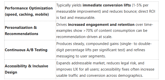

Digging deeper, you should balance short-term performance work with ongoing experimentation: prioritize fixes that unblock conversions first, then invest in personalization and accessibility to compound gains and improve long-term consumer behavior.
The Future of User Experience
Emerging Trends in UX Design
Augmented reality (AR), progressive web apps (PWAs), and voice-first interfaces are becoming production-ready tools you should plan for: Twitter Lite’s PWA reduced data usage by roughly 70% and increased engagement metrics substantially, and retailers that add AR product previews report higher consideration and lower return rates. You’ll also see microinteractions and motion design used not just for polish but to communicate state changes and reduce cognitive load-small animations can cut task error rates and make complex flows feel intuitive.
Design systems and component libraries will accelerate delivery while keeping consistency across platforms; companies that adopt them typically shorten design-to-dev cycles and lower maintenance costs. Expect more data-driven UX: you’ll instrument experiments that tie UI changes directly to LTV and retention metrics, using event analytics to prioritize fixes that move the needle for conversion and churn.
The Influence of Artificial Intelligence
AI is shifting UX from static surfaces to adaptive, context-aware experiences: you can deploy recommendation models that personalize content in real time-platforms like Netflix and Amazon already drive a substantial share of engagement through recommendations-and language models like ChatGPT reached ~100 million monthly users within months of launch, proving rapid adoption of conversational interfaces. You should use ML for personalization, dynamic layout decisions, and predictive search to reduce friction and increase conversion.
Beyond personalization, AI will speed up design and testing workflows: tools can auto-generate wireframes from user stories, run heuristic checks for accessibility issues, and surface likely drop-off points based on historical funnels so you can prioritize experiments. That said, you must balance automation with oversight because model errors can produce biased or misleading UI outcomes that harm trust and usability.
Operationally, implement continuous monitoring for model drift, log explanations for key predictions, and keep human-in-the-loop review for high-impact decisions; you’ll protect user trust and comply with privacy rules like GDPR by combining explainability, consented data use, and robust audit trails.
Anticipating Consumer Expectations
Speed, clarity, and privacy will be non-negotiable: users often abandon slow pages-mobile abandons spike above roughly 3 seconds of load time-so you must target sub-2 second interactive times and optimize critical paths like search and checkout. Consumers also expect seamless continuity across channels: studies show a majority of shoppers use multiple touchpoints during a purchase journey, so your UX should preserve context and preferences as users move from app to web to in-store.
Privacy and transparency will shape trust and retention; PwC-style research indicates many customers will take their business elsewhere if they don’t feel their data is handled appropriately, so you should design clear, granular consent flows and simple privacy dashboards. Also, plan for hyper-personalization without creepiness: surface helpful, relevant content while giving users control over personalization settings.
Practically, use cohort analysis and predictive analytics to anticipate needs-run targeted holdout tests to validate predictive features before full rollouts-and instrument post-interaction surveys to capture expectation gaps; doing so gives you a data-backed roadmap to meet evolving user demands and turn expectation management into a competitive advantage.
The Importance of Cross-Functional Collaboration
Collaboration Between Designers and Developers
You should embed designers and developers in the same workflows: co-own the design system, pair on component implementation, and run joint sprint planning so specs and technical constraints align before work begins. Using a shared toolchain-Figma + Storybook, design tokens, and automated visual regression tests-reduces handoff friction and prevents the common scenario where pixel-perfect mocks are implemented incorrectly.
Fixing a UX problem after release is often 10x-100x more expensive than addressing it during discovery or prototyping, so you must prioritize early collaboration. Schedule regular design-dev code reviews, treat UI components as versioned code, and create a living styleguide; teams that do this typically cut rework and time-to-market by a noticeable margin.
Involving Stakeholders in UX Design
You should invite product, marketing, sales, and support into user-research sessions and synthesis workshops so decisions reflect commercial goals and frontline insights. Testing with just five real users can reveal roughly 85% of major usability issues, and when stakeholders watch sessions they stop arguing in hypotheticals and start solving observed problems.
When stakeholders own success metrics-NPS, task completion, conversion funnels-they provide faster approvals and clearer trade-offs. Use short, focused demos and a one-page decision log (RACI-style) to keep alignment; that simple governance prevents feature bloat and keeps experiments tied to measurable outcomes.
For practical steps, map stakeholder influence vs. interest, run a half-day discovery with key reps, and publish a shared dashboard showing UX KPIs (drop-off rates, task success, time-on-task). These rituals turn ad-hoc feedback into prioritized work and make it easier for you to justify design decisions with data.
Creating a UX-Centric Company Culture
You must bake UX into hiring, onboarding, and OKRs so the organization rewards measured improvements in user outcomes. Run monthly UX brown-bags, establish a UX guild that meets quarterly, and require product roadmaps to include at least one research or usability-improvement item per quarter; these practices institutionalize user-focused thinking across teams.
Design systems and visible KPIs reinforce culture: appoint a design-system owner, publish component adoption metrics, and surface UX impact in executive reviews. When leadership sees metrics-like a sustained uptick in task success or a reduction in support tickets-UX becomes a business priority rather than a nice-to-have.
Operationally, allocate a small, protected portion of each sprint (for example, 10-20% of capacity) to research, accessibility fixes, and UX debt; that predictable investment prevents slow erosion of product quality and lowers long-term maintenance costs.
Measuring User Experience Success
Key Performance Indicators for UX
Define a balanced set of KPIs that tie user behavior to business outcomes: conversion rate, task success rate, time on task, error rate, bounce rate, retention, and sentiment metrics like NPS or CSAT. For example, you should benchmark core task success rates above 80-90% for primary flows (signup, checkout) and aim for error rates under 5% for form-driven processes. Page load time is a performance KPI with direct monetary impact: Google data shows bounce probability rises sharply as load time goes from 1s to 3s (about +32%), and Amazon historically linked every 100ms of latency to measurable revenue decline.
Segment KPIs into micro- and macro-conversions so you can act on the earliest signs of friction: measure add-to-cart, form completion, and payment success separately rather than only tracking final sales. If your industry faces typical cart abandonment rates around ~70% (e.g., e-commerce benchmarks), focus on reducing abandonment at the highest-drop steps first. Tie each KPI to a clear target and confidence threshold so A/B tests can validate whether a UX change produced a meaningful lift-plan for detectable effects in the 2-5% range depending on traffic volume.
Analyzing User Behavior with Analytics
Instrument funnels and behavioral events across your site using tools like Google Analytics, Mixpanel, Hotjar, or FullStory to uncover where users deviate from expected paths. You can combine funnel reports with heatmaps and session recordings to see that a 15% drop at the shipping step corresponds with form confusion, or that a CTA’s low click-through is caused by its placement below the fold. Establish event names for each milestone (e.g., checkout_started, address_verified, payment_success) so you can attribute drop-offs precisely.
Use cohort and retention analysis to understand long-term UX effects: track how new-user activation in the first seven days correlates with 30- and 90-day retention and lifetime value. Segment by device, acquisition channel, and geography to spot systemic issues-mobile users often show higher abandonment, so compare mobile conversion funnel rates to desktop and prioritize fixes where the disparity exceeds your acceptable threshold (for instance, >10 percentage points).
Make data quality a priority: implement a consistent event taxonomy (include user_id, session_id, page, event_name, timestamp and relevant properties) and validate that client- and server-side events reconcile to the same revenue figures. Also account for sampling, ad blockers, and privacy controls that can skew analytics; where possible enrich event streams with backend confirmations to avoid false negatives.
Continuous Improvement through Metrics
Operationalize UX improvement by running a steady cadence of experiments and monitoring dashboards: set weekly dashboards for key funnel steps, run 3-5 UX-focused experiments per quarter, and adopt short sprints to iterate on proven wins. Combine qualitative feedback (session recordings, user interviews) with quantitative lifts to justify changes-quick wins that lift conversion by 2-10% should be shipped immediately, while larger architectural fixes can be planned into roadmap cycles.
Protect against regressions with active alerting and synthetic checks: set SLA targets such as a median page load of ≤2s on mobile and configure RUM alerts for deviations, because small regressions (even 100ms) have historically translated into measurable revenue drops. Maintain dashboards that show both macro KPIs (revenue, conversion) and micro signals (form error rate, field abandonment) so you catch performance or UX regressions early.
Prioritize your improvement backlog using a simple impact framework (e.g., ICE: Impact × Confidence × Ease, each scored 0-10) so you target items that promise the greatest return per effort. Score ideas quantitatively-an item with Impact 8, Confidence 7, Ease 5 yields an ICE score of 280-and act on the highest scorers first to maximize the ROI of your UX team’s limited capacity.
Cost-Benefit Analysis of UX Investments

Calculating ROI for UX Improvements
When you quantify UX benefits, start with measurable outcomes: conversion rate lift, average order value (AOV), and support cost reduction. For example, if your site gets 1,000,000 visits/month at a 2.0% conversion rate and a $50 AOV, a 20% lift in conversions (to 2.4%) yields an extra 4,000 conversions → $200,000/month. Subtract the one-time and recurring UX costs to calculate ROI: (benefit − cost) ÷ cost. That simple arithmetic makes A/B test wins and research investments speak directly to finance.
You should also include indirect savings: fewer support tickets, lower churn, and reduced development rework. Historical benchmarks are useful-Amazon found every 100ms of latency cost about 1% in sales, and Walmart reported conversion gains of roughly 2% for each 1s improvement in load time-so small technical or interface fixes often pay for themselves fast. Use conservative lift estimates (5-15%) in your base case and run sensitivity scenarios to show best/worst outcomes to stakeholders.
Long-term Gains from Prioritizing UX
If you treat UX as an ongoing discipline, gains compound: better onboarding increases lifetime value, fewer errors lower support expenses, and stronger product-market fit reduces churn. Industry analysis shows that a modest retention improvement can be powerful-a 5% rise in customer retention can boost profits by 25-95%-so small UX-driven retention changes materially affect valuation and cash flow.
You should also factor in brand and discovery benefits: a smoother experience improves reviews, referrals, and organic search metrics (lower bounce, higher dwell time). Those upstream benefits reduce your effective customer acquisition cost (CAC), which means the same UX investment that increases conversion today also lowers marketing spend tomorrow.
More specifically, calculate lifetime value (LTV) changes: multiply incremental retention and AOV improvements from UX work against customer acquisition and maintenance costs to get a multi-year view. For instance, reducing churn by 1% on a base of 100,000 customers with $200 annual revenue each adds roughly $200,000/year in recurring revenue-numbers that justify multi-year UX teams and roadmap prioritization.
Budgeting for Effective UX Design
Start by allocating budget by project phase: discovery & research (15-25%), design & prototyping (25-35%), testing & iteration (20-30%), and implementation/support (20-30%). For companies in early product-market fit you might devote 10-20% of the product budget to UX; at scale, continuous UX work is typically 5-10% of product spend plus a dedicated design and research team.
Line-item expected costs help make the case: a senior in-house UX designer salary typically ranges from $90k-$140k/year, hourly freelance rates from $50-$150/hr, and agency work often runs $100-$250+/hr. Usability testing budgets vary-remote unmoderated tests can be done for <$1,000, while moderated lab studies and larger panels run $5,000-$20,000. Tool subscriptions and participant recruitment are additional but predictable line items.
Operationally, reserve 10-20% of the UX budget for rapid experiments and urgent accessibility fixes so you can capture quick wins without derailing planned initiatives. Tie budget tranches to clear KPIs (conversion lift, NPS, task completion rates) and require post-mortem ROI calculations for major spends to keep investment velocity aligned with business outcomes.
Final Words
Considering all points, you can see that website design directly shapes consumer behavior by influencing perception, ease of use, and trust. When your layouts prioritize clarity, speed, and predictable interactions, visitors move through your site with less friction, engage more deeply, and are more likely to complete desired actions such as signing up, purchasing, or recommending your brand.
You should treat UX as an investment that you continuously test and refine: track behavior, run experiments, and apply insights to reduce barriers and amplify value. By aligning design decisions with measurable user outcomes, you ensure your site not only attracts attention but converts it into sustained customer relationships and measurable business results.
FAQ
Q: How does website design directly affect consumer decision-making?
A: Design shapes first impressions, guides attention, and lowers friction during tasks. Clear hierarchy, readable typography, and intuitive navigation speed up comprehension and reduce hesitation, which increases the likelihood of clicking, signing up, or purchasing. Visual cues like color contrast and placement of calls-to-action steer choices without extra cognitive effort.
Q: What psychological principles in UX influence user behavior?
A: UX leverages cognitive load management, Hick’s law (fewer choices = faster decisions), and Gestalt principles (grouping and visual patterns) to make interfaces predictable and trust-inspiring. Consistency, feedback, and progressive disclosure reduce uncertainty and support confident actions, while emotional design elements (trust signals, familiar imagery) strengthen preference and brand affinity.
Q: How does improving UX affect conversion rates and revenue?
A: Better UX reduces abandonment by simplifying goal completion (checkout, signup), shortening task times, and minimizing errors, which directly raises conversion rates. Small UX changes-faster load times, streamlined forms, clearer CTAs-often produce measurable revenue gains by increasing throughput of successful transactions and lowering support costs.
Q: In what ways does UX build trust and perceived credibility?
A: Professional, consistent design and transparent interactions convey competence and reliability. Clear privacy cues, accessible contact information, visible reviews, and straightforward policies reduce perceived risk; those signals make visitors more willing to share data, make purchases, or return, reinforcing long-term customer relationships.
Q: How can organizations measure the impact of UX on consumer behavior?
A: Combine quantitative metrics (conversion rate, task completion rate, bounce rate, time on task, funnel drop-off) with qualitative insights (usability testing, session recordings, customer interviews). A/B testing isolates specific design changes, while cohort analysis tracks behavior over time; together these methods link UX adjustments to concrete business outcomes.